Photo Story
Neighbors,
not projects.
Brand Identity · 2026
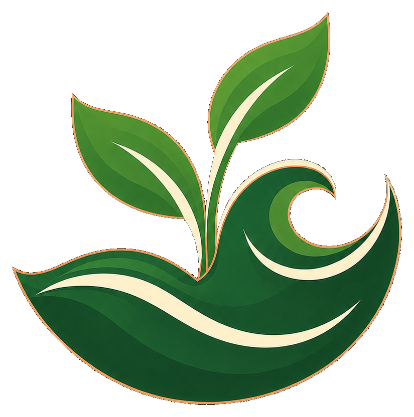
A sprout emerging from a Caribbean wave — the HavenReach mark tells the whole story: communities growing on their own terms, supported but never steered.
01 · The Mark
The primary mark carries the full palette — deep greens, cream swooshes, copper linework. Monochrome versions adapt it to any surface while keeping the silhouette unmistakable.
 HavenReachHavenReach
Clear space
Keep a margin around the mark equal to the height of one leaf. Never crowd it with text or other graphics.
Minimum size
Never render the mark below 24px tall on screen or 10mm in print — the swooshes must stay legible.
Don't
Don't recolor outside the four approved versions, add drop shadows, rotate, stretch, or place the color mark on busy photography.
02 · Color
Drawn directly from the mark: the deep greens of Dominica's interior, copper like sun on skin and soil, cream like sand and sails. Green leads, copper accents, cream breathes.
03 · Typography
DM Sans does all the talking — heavy and direct at display sizes, light and open in body copy. Cormorant Garamond remains as a quiet accent, reserved for pull quotes and testimonials.
Display · DM Sans
Service with purpose.
Extra Bold 800 for heroes, Bold 700 for section titles · Tight tracking (−0.02em) · The copper word is the signature move — no italics, color does the emphasis.
Text · DM Sans
HavenReach partners alongside local leaders to create meaningful, lasting change — not by bringing our own plans, but by helping communities bring theirs to life.
Light 300 for body · Medium 500 for labels, Bold 700 for buttons — always letterspaced and uppercase. Cormorant Garamond italic appears only in quotes. Never below 14px on screen.
04 · Voice
Grounded, not grandiose
Concrete nouns and real numbers over abstractions. We say what we did and what it cost.
“Fifty dollars puts cleats and a match ball in one kid's hands.”
Community first, always
The community is the subject of the sentence. HavenReach supports; it never saves.
“The community chose the site. We helped pour the foundation.”
Warm, never saccharine
No pity, no poverty tourism, no exclamation points doing the work. Dignity is the default.
“This is what lasting looks like: a water tap the village runs itself.”
05 · In the Wild
Profile avatars at every size, and three social post patterns: photo story, project update, and quote card.
Profile · 400px
Alt · copper
Alt · cream
Favicon · 56px
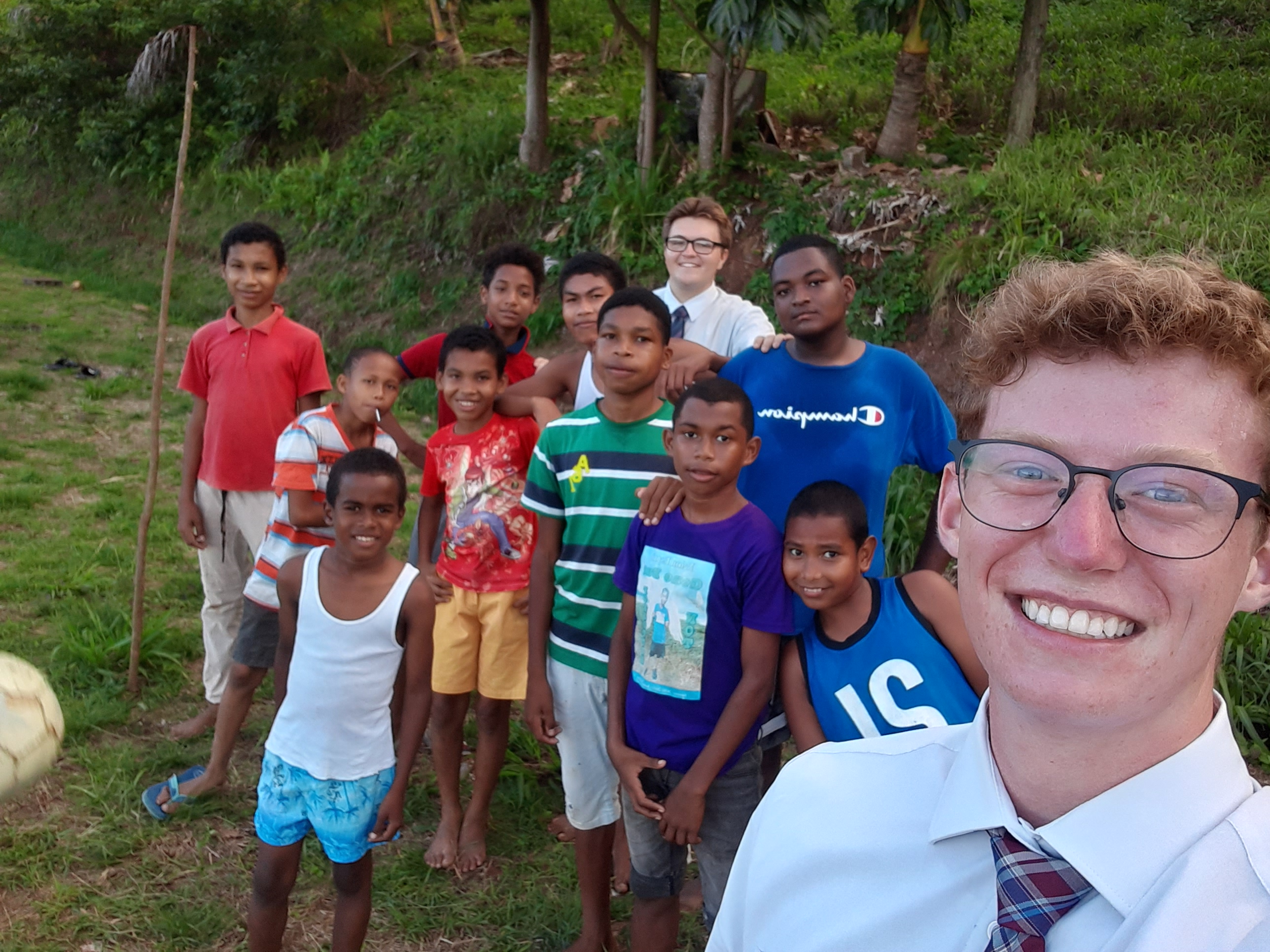
Photo Story
Neighbors,
not projects.
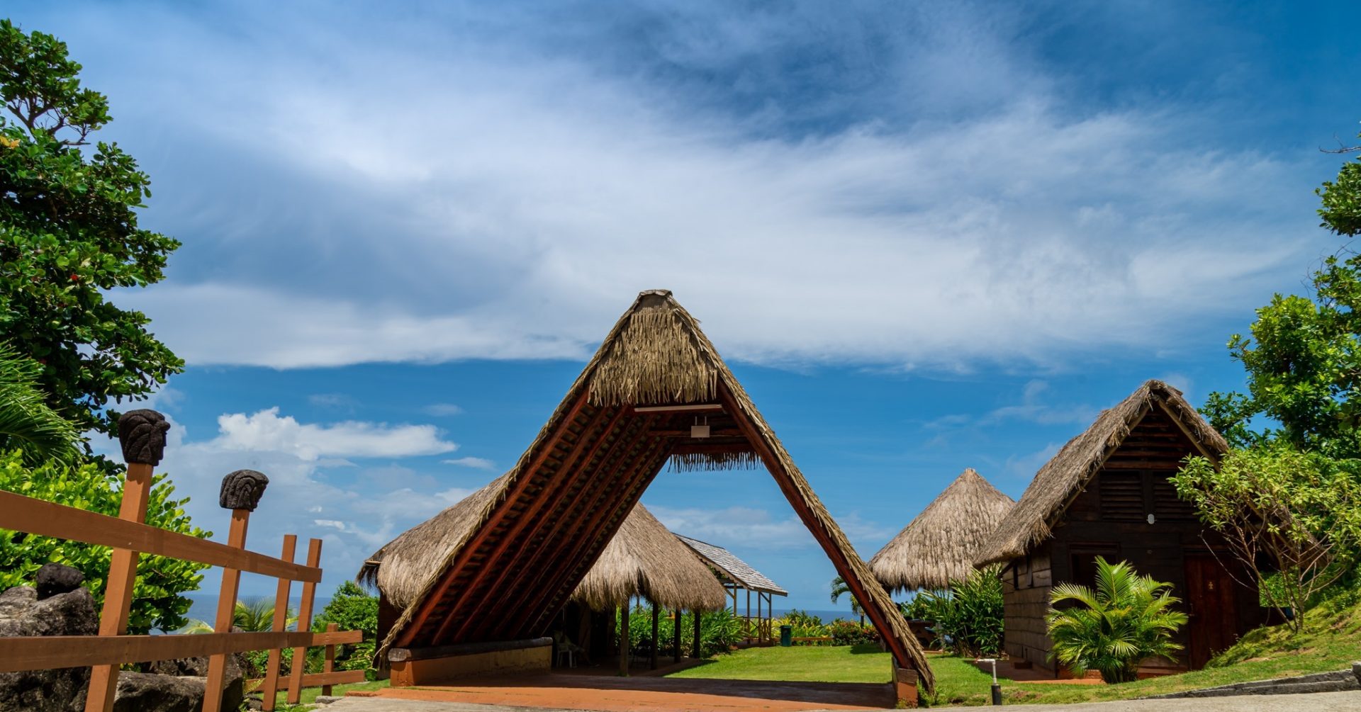
Project Update
Campground shelters:
underway.
“We don't bring plans. We bring support.”